Brand J
Identity & Website
Brand J needed a fresh new look from the ground up.

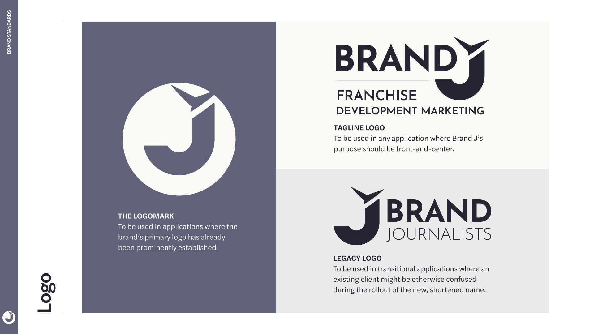
The Logo
The new logo was born from the concept, “Your Story Takes Flight.” The abstract mark above the J was designed to represent an impression of “flight,” while allowing for some amount of interpretation by the viewer. Brand J is dedicated to storytelling, and while a good story is always clear in the message it conveys, it can also mean different things to different people. The mark has been seen as a bird, a paper airplane, or even a jet. All are valid interpretations.
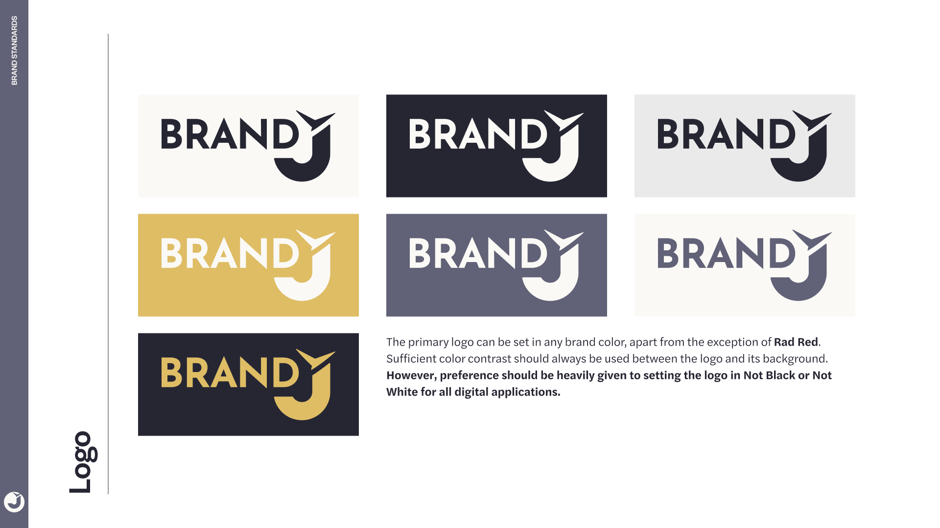
The full wordmark is strong but friendly, nestled together comfortably and conveying a sense of approachable confidence — in accordance to the brand’s voice.
Brand Standards
The Website
I worked with the client to build out a new navigation tree and worked with a copywriter to fully re-write the site’s content. As part of the overall redesign and new brand standards, I developed a full design system and component library in Figma from the ground up.